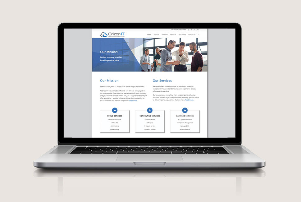
OrizonIT – website
Digital design

OrizonIT were an IT consultancy who wanted to add a professional design touch to the bare bones of the website that they’d developed in-house, in a cost effective way. I worked with them to analyse the UX and structure of their website, advised them on the structure and flow of information and created a design look and feel with accompanying digital assets such as web sliders and graphics to add personality to their website.
